
Customer Portal Image Sizes Explained for Designers
What Is This?
This is a size guide for the designer who makes your customer portal artwork. For each image it shows three things: where you upload it in the Admin Panel, where your customers see it, and the size to export. Hand this page to your designer before they start, so nothing gets cropped in the wrong place.
Real-Life Example
Farah hires a freelance designer to refresh her seafood restaurant's portal. Last time, the designer sent one tall poster for everything. The hero lost its headline under the Quick Links card, and the logo looked squashed. This time Farah sends this page first. The designer exports each image at the size in the table and keeps text away from the covered edges. Everything fits on the first upload.
Video Walkthrough

Reference
| Image | Where customers see it | Size to export | Upload in |
|---|---|---|---|
| Hero Banners | Top of the home page, 1 to 5 slides | 860 x 768 | Customer Portal Design → Style |
| Logo | Login card and page footer | 300 x 150 (2:1) | Customer Portal Design → Style |
| Favicon | Browser tab and home-screen icon | 150 x 150 (1:1) | Customer Portal Design → Style |
| Desktop Backdrop | Behind the portal on computers and on the login screen | 1920 x 1080 | Customer Portal Design → Style |
| Cover Background | Header band on Rewards, Profile and other inner pages | 860 x 380 | Customer Portal Design → Style |
| Referral Cover | Referral banner on the Profile page and Referral page | 860 x 380 | Customer Portal Design → Feature |
| Custom Button Image | Two picture buttons on the Profile page | 1280 x 720 (16:9) | Customer Portal Design → Feature |
| Announcement Image | Pop-up when the portal opens | Any shape, up to 5 MB, up to 5 images | Customer Portal Design → Announcement |
| News Feed Thumbnail | Banner cards on the home page | 720 x 405 (16:9) | News Feeds |
| Reward Custom Cover | Reward cards in the Rewards Centre | 512 x 512 (1:1) | Rewards |
| Tier Background Image | Tier card on the Profile page | 860 x 380 | Tier Configurations |
| Stamp Card image | Top of the stamp card | 1280 x 720 (16:9) | Stamp Campaigns |
| Stamp artwork | Each stamp slot, before and after collection | 512 x 512, up to 2 MB | Stamp Campaigns → Stamps |
| Paid Membership Cover Image | Membership plan card | 1280 x 720 (16:9) | Paid Memberships |
Most slots crop your upload to the shape above and resize it for you. Keep logos and text away from the edges.
Hero Banners
Upload in Admin Panel → Loyalty Program → Customer Portal Design → Edit → Style → Hero Banners.

Upload 1 to 5 banners and drag to reorder. More than one becomes a sliding carousel.

The banner fills the top of the home page. The Quick Links card covers its bottom edge, so keep the bottom fifth free of text.
- Size: 860 x 768. Uploads are cropped to this shape.
- Display Mode: Cover fills the area and may crop. Auto and Contain show the whole image.
- If missing: the area shows a plain navy block. Use Use Default to restore the Pixalink banner.
Logo
Upload in Customer Portal Design → Style → Logo.

Helper text: Size 300x150 (2:1), PNG, JPEG or WebP.

The logo sits at the top of the login card.

It also shows in the footer of every page, above Powered By.
- Size: 300 x 150 (2:1). This slot does not crop, so export at 2:1 yourself. A transparent PNG works best.
- If missing: no logo shows on the login card or footer.
Favicon
Upload in Customer Portal Design → Style → Favicon.

Helper text: Size 150x150 (1:1), PNG, JPEG or ICO.

The favicon is the small icon in the browser tab. It is also the icon when a customer adds the portal to their home screen.
- Size: 150 x 150 (1:1). Uploads are cropped square. Use a simple, bold mark, since fine detail disappears at tab size.
Desktop Backdrop
Upload in Customer Portal Design → Style → Desktop Backdrop.

Helper text: Size 1920x1080.

On a computer, the portal is a phone-width card in the middle. The backdrop fills the rest of the screen.

On phones, it only shows on the login screen, behind the login card.
- Size: 1920 x 1080. Uploads are cropped to this shape. The middle is covered by the portal, so keep detail at the sides. Soft, low-contrast art reads best.
Cover Background
Upload in Customer Portal Design → Style → Cover Background.

Helper text: Size 860x380.

It is the header band on the Rewards Centre, Profile, Reservations and other inner pages.
- Size: 860 x 380. White text sits on top, so use darker, calm art.
- Pinned to the top right: on taller headers the image is cropped from the left and bottom.
- If missing: the header shows a plain navy band.
Referral Cover
Upload in Customer Portal Design → Feature → Referral Program → Referral Cover.

Helper text: Optimal size for background images is 860x380 pixels.
- Where customers see it: as a banner under Features on the Profile page, and at the top of the Referral page.
- Size: 860 x 380. Put the offer, like "Get RM5", in the centre.
- If missing: a default Pixalink referral banner shows.
Note
The banner only appears once a referral programme is set up under Referral Configurations. Our demo account has none, so no portal screenshot is shown here.
Custom Button Image
Upload in Customer Portal Design → Feature → Custom Button → Button 1 / Button 2 → Image.
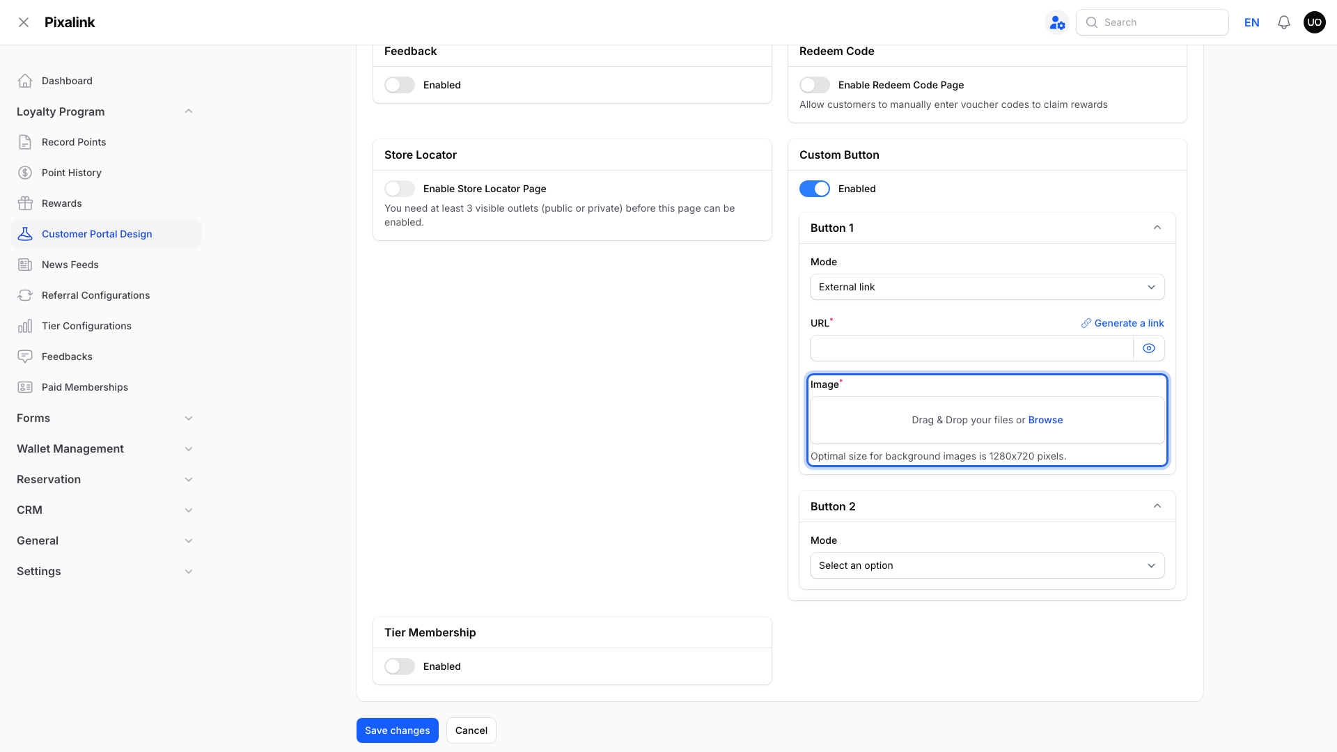
Helper text: Optimal size for background images is 1280x720 pixels.

The two buttons sit side by side on the Profile page. The whole image is the button.
- Size: 1280 x 720 (16:9). Uploads are cropped to 16:9. Each button shows at under half the screen width, so use big, short text.
Announcement Image
Upload in Customer Portal Design → Announcement, with Content Type set to Image.

Helper text: JPEG, PNG, GIF, WebP. Max 5MB, max 5 images.
- Where customers see it: in a pop-up when they open the portal. See How to Create an Announcement.
- Size: no fixed shape and no cropping. The pop-up is phone width, so design for a narrow screen.
- Video option: MP4 or WebM, 480p or lower, under 10 seconds, up to 5 MB.
Note
No announcement is turned on in our demo account, so no pop-up screenshot is shown here.
News Feed Thumbnail
Upload in Admin Panel → Loyalty Program → News Feeds → Edit → Thumbnail.

Helper text: Size 720x405 (16:9), PNG, JPEG or WebP.
- Where customers see it: as a full-width banner card on the home page, below the member card. See How to Create a News Feed Item.
- Size: 720 x 405 (16:9). Uploads are cropped to this shape.
Note
The news feeds in our demo account have ended, so the home page has no card to show here.
Reward Custom Cover
Upload in Admin Panel → Loyalty Program → Rewards → Edit → Reward Details. Set Cover Image to Custom, then use Custom Cover.

Helper text: images auto-adjust to 1:1; ideal viewing at 512x512px.

The cover is the square picture at the top of each reward card.
- Size: 512 x 512 (1:1). Uploads are cropped square.
- If you skip it: pick one of the three ready-made covers in Cover Image instead.
Tier Background Image
Upload in Admin Panel → Loyalty Program → Tier Configurations → Edit → Edit on a tier row.
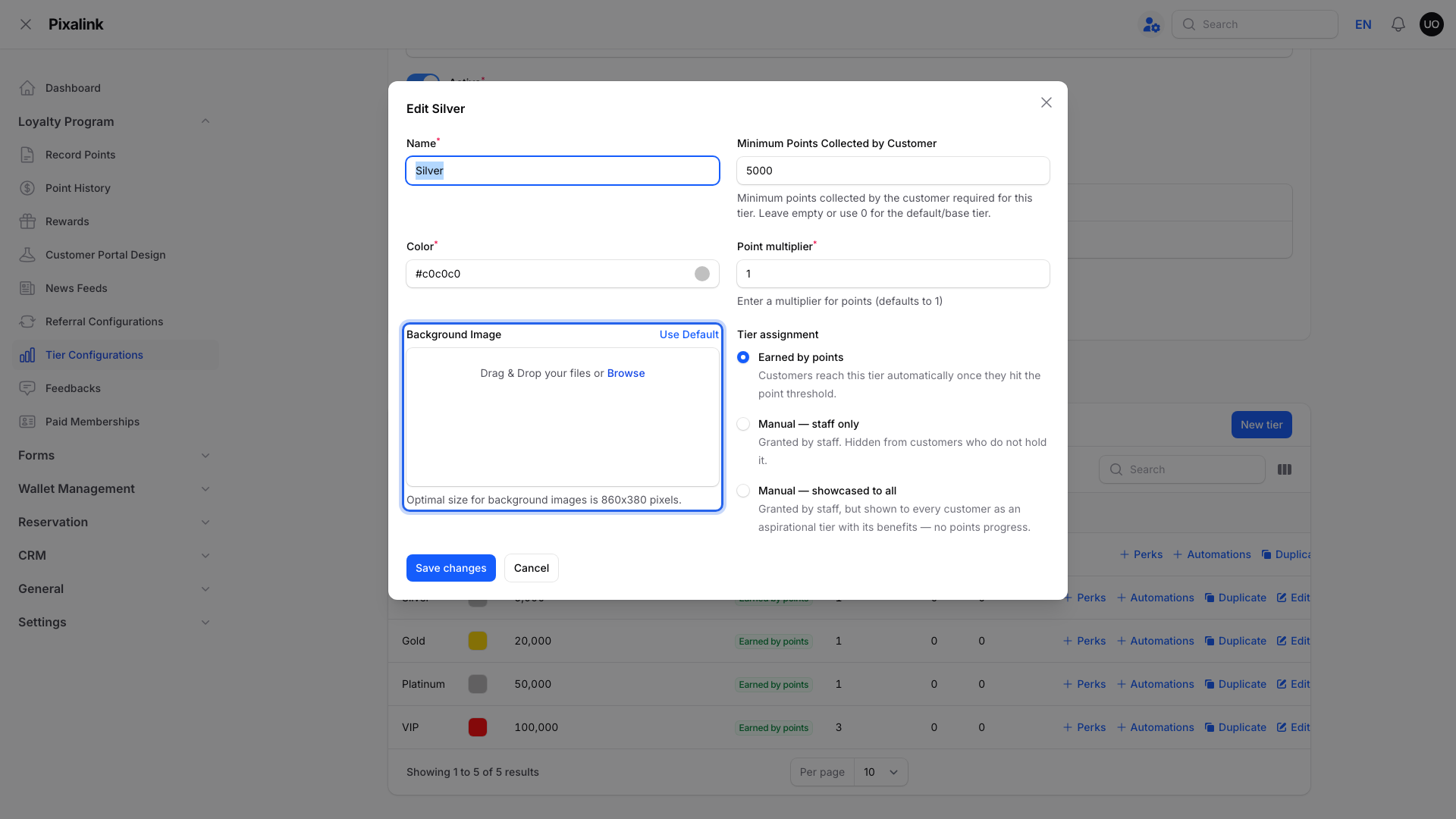
Helper text: Optimal size for background images is 860x380 pixels.

The tier card on the Profile page. This tier has no image, so its tier colour fills the card.
- Size: 860 x 380. Uploads are cropped to this shape. The tier name sits top right and the member name along the bottom, so keep both areas plain.
Stamp Card image and stamp artwork
Upload in Admin Panel → Loyalty Program → Stamp Campaigns. Card image is on the Details tab. Default artwork before collection and Default artwork after collection are on the Stamps tab.
- Card image: 1280 x 720 (16:9), PNG, JPEG or WebP. It shows above the stamps on the customer's stamp card.
- Stamp artwork: square 512 x 512, JPEG, PNG or WebP, up to 2 MB. Leave blank to use the default stamp. You can also set artwork for one stamp position.
Note
Stamp Campaigns is not turned on for our demo account, so no screenshots are shown. See How to Set Up a Stamp Card Campaign.
Paid Membership Cover Image
Upload in Admin Panel → Loyalty Program → Paid Memberships → Create → Details → Cover Image.

Helper text: Upload a 16:9 aspect ratio image.
- Where customers see it: on each plan card on the Membership page.
- Size: 1280 x 720 (16:9). Uploads are cropped and resized to this.
Note
Our demo account has no membership plan, so no portal screenshot is shown here.
Good to Know
- Click Where is this used? next to a theme upload box to see an example in the Admin Panel.
- Use Default puts back the Pixalink image for Hero Banners, Favicon, Desktop Backdrop, Cover Background and Referral Cover.
- Changes to Customer Portal Design take effect after you click Save changes. Phones may show the old image until the page is refreshed.
- Outlet photos for your outlet page are a separate set. See How to Add Images to Your Space.
Need Help?
Send your artwork to the Pixalink support team and we'll check it against these sizes.