How to Customise Your Customer Portal Theme
How to Customise Your Customer Portal Theme
What Is This?
Your customer portal is the first thing customers see when they interact with your loyalty programme online. With theme customisation, you can match the portal's colours, images, and layout to your brand -- so it looks and feels like your own app.
Real-Life Example
Siti runs a chain of bubble tea shops called "TeaLicious" across Kuala Lumpur. When she first launched her loyalty programme, the portal used the default design -- blue colours and generic images. Customers didn't realise it was connected to TeaLicious. Siti went into Customer Portal Design and uploaded her pink-and-white logo, changed the primary colour to match her brand, and added a hero banner showing her best-selling drinks. The next week, her team noticed more customers signing up because the portal finally looked like a natural extension of the TeaLicious brand.
How to Set It Up
-
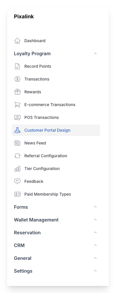
Go to Admin Panel → Loyalty Program → Customer Portal Design.
-
Click New Customer Portal to create a new theme, or click the pencil icon next to an existing theme to edit it.
-
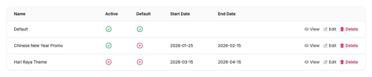
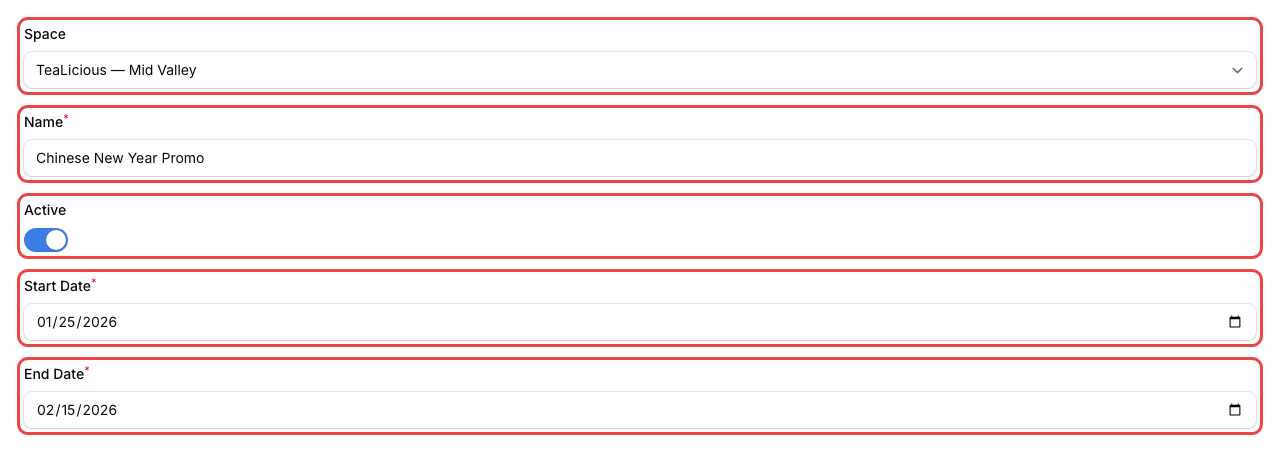
Fill in the Info tab:
- Space -- if you have multiple locations, pick the location this theme applies to
- Name -- give your theme a recognisable name (e.g., "Default" or "Chinese New Year Promo")
- Active -- turn this on so the theme is live
- If this isn't your first theme, set a Start Date and End Date for when it should appear. Your first theme becomes the default and runs all the time.
-
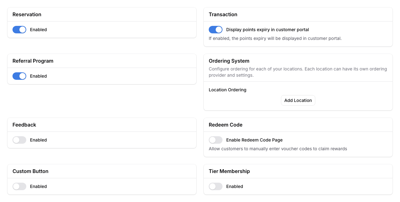
Click the Feature tab to turn portal features on or off. Sections include:
- Reservation -- let customers book through the portal (via Pixalink's built-in system or a custom link)
- Transaction -- choose whether to show points expiry dates to customers (only visible if your programme uses points expiry)
- Referral Program -- let customers invite friends and upload a custom referral cover image
- Ordering System -- connect an online ordering provider (Beep, Eats365, or a custom link) per location
- Feedback -- collect customer feedback directly, with options for login, anonymous, or semi-anonymous mode
- Redeem Code -- let customers redeem third-party voucher codes (only visible if this feature is enabled for your account)
- Custom Button -- add up to 2 extra buttons. Each button can be set to one of three modes: Announcement pop-up (reuses your announcement), General pop-up (custom title and content), or External link (opens a URL)
- Tier Membership -- show tier progress to customers
-
Click the Style tab to customise your branding.
-
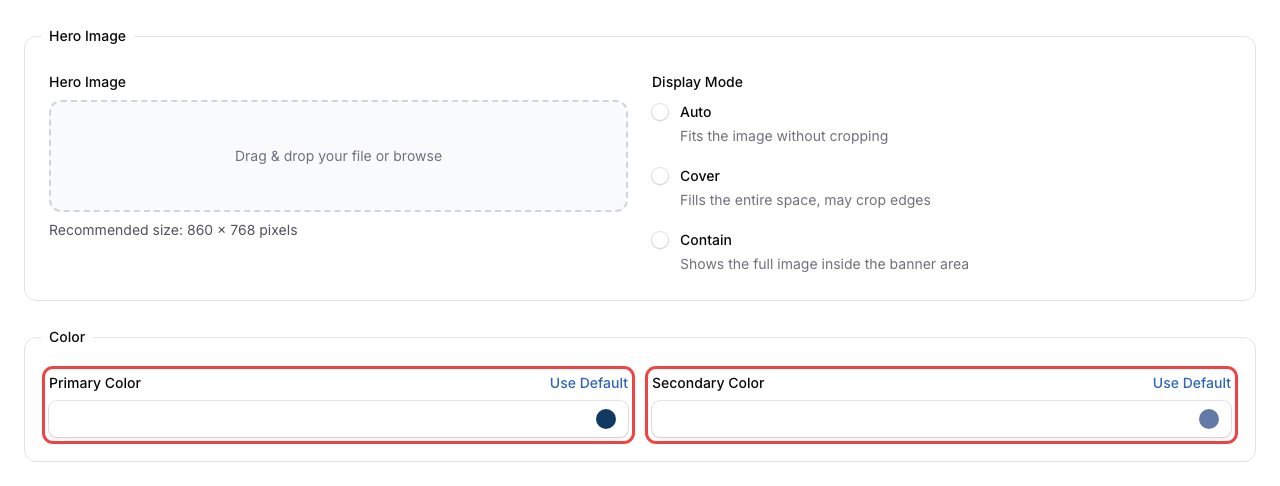
Upload your Hero Image -- this is the main banner customers see at the top of the portal. Best size is 860 x 768 pixels. Choose a Display Mode:
- Auto -- fits the image without cropping (best when your image is the exact recommended size)
- Cover -- fills the entire space, may crop edges
- Contain -- shows the full image inside the banner area
-
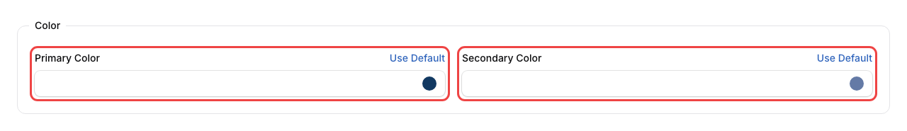
Still on the Style tab, set your brand colours under the Color section:
- Primary Color -- used for buttons, links, and highlights throughout the portal
- Secondary Color -- used for accents and supporting elements
- Click Use Default to reset to the standard colours anytime
-
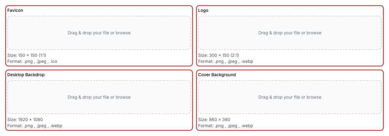
Still on the Style tab, upload your Favicon (the small icon shown in browser tabs), Logo, Desktop Backdrop (the background behind the portal on wide screens), and Cover Background (the banner behind your customer's name and points).
- Each image has a "Where is this used?" button you can click to see exactly where it appears on the portal.
- Each image also has a Use Default button to restore the original.
-
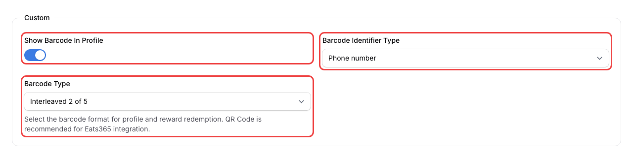
Still on the Style tab, you can turn on Show Barcode In Profile under the Custom section to display a scannable barcode on your customer's profile page. If enabled, choose the Barcode Identifier Type (phone number or customer ID) and the Barcode Type (format).
-
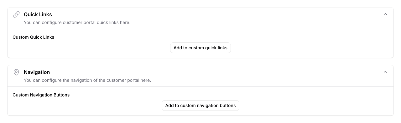
If the Layout tab is available, click it to customise your portal's Quick Links and Navigation buttons. You can rearrange items, change icons and labels, and link each button to a feature, a pop-up, or an external URL. This tab is only visible if Custom Layout is enabled for your account.
-
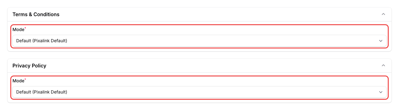
Click the Legal tab to add your own Terms & Conditions and Privacy Policy. You can:
- Use the Pixalink default
- Write your own text
- Paste a link to your existing page
- Upload a PDF file
-
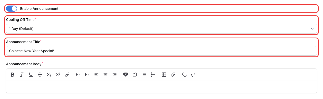
Click the Announcement tab if you want to show a pop-up announcement to customers when they open the portal. Set a Cooling Off Time to control how often customers see it again (from 12 hours to 30 days).
-
Click Save to apply your changes.
What Your Customers Will See
After you save your theme, customers visiting your portal will see your brand colours, logo, and images throughout the experience. The hero banner appears at the top of their home screen, your logo shows in the header, and all buttons and links use your chosen primary colour. If you set up an announcement, it pops up the first time they visit.
Good to Know
- Your first theme is automatically set as the default and doesn't need start/end dates. It stays active unless a scheduled theme takes over.
- Scheduled themes override the default during their date range. Once a scheduled theme expires, the portal switches back to the default.
- You can only have one active theme per location at any time.
- Use the "Where is this used?" button next to each image upload to see a preview of where that image appears on the portal. This helps you pick the right image for each slot.
- Image sizes matter. Upload images at the recommended sizes for the best look:
- Hero Image: 860 x 768 pixels
- Logo: 300 x 150 pixels
- Favicon: 150 x 150 pixels
- Desktop Backdrop: 1920 x 1080 pixels
- Cover Background: 860 x 380 pixels
What's Next?
- How to Set Up Referrals -- let customers invite their friends through the portal
- How to Set Up the Feedback Feature -- collect reviews and ratings from your customers
- How to Create an Announcement -- display important messages on the portal