Custom Navigation Buttons on Your Customer Portal
Custom Navigation Buttons on Your Customer Portal
What Is This?
Navigation buttons are the bottom bar of your customer portal — the row of icons customers tap to move between pages. By default, your portal shows four buttons: Home, Order, Rewards, and Profile. With custom navigation, you can change what those buttons say, which icons they use, and where they take your customers.
Real-Life Example
Ahmad runs a salon chain called "Glow Studio" with a loyalty programme. His customers kept asking how to book appointments through the portal, but the default navigation only had Home, Order, Rewards, and Profile. Most customers never found the reservations page.
Ahmad opened his Customer Portal Design settings and swapped the "Order" button for a "Book" button pointing to the reservations page. He also replaced "Profile" with "Refer" linking to the referral page, since his referral programme was his biggest growth driver. Within days, reservation bookings through the portal doubled and referral sign-ups jumped. The change took him about two minutes.
This feature requires activation. Custom navigation is not enabled by default. Contact our support team to have it turned on for your account before following the steps below.
How to Set It Up
-
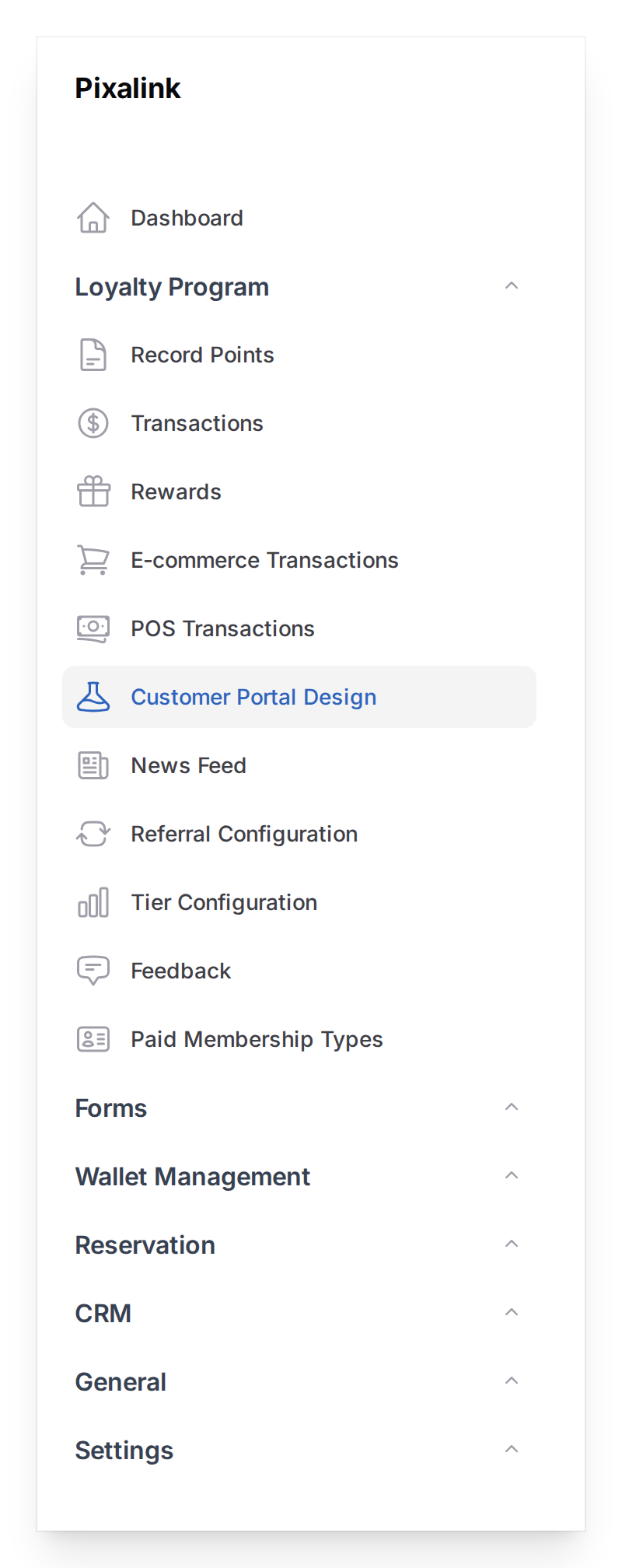
Go to Admin Panel → Loyalty Program → Customer Portal Design
-
Find the theme you want to edit and click Edit
-
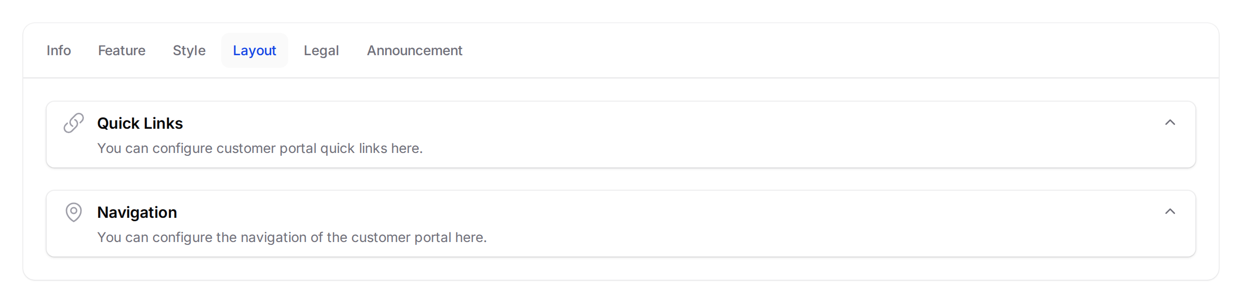
Click the Layout tab at the top of the form, then click on the Navigation section to expand it
-
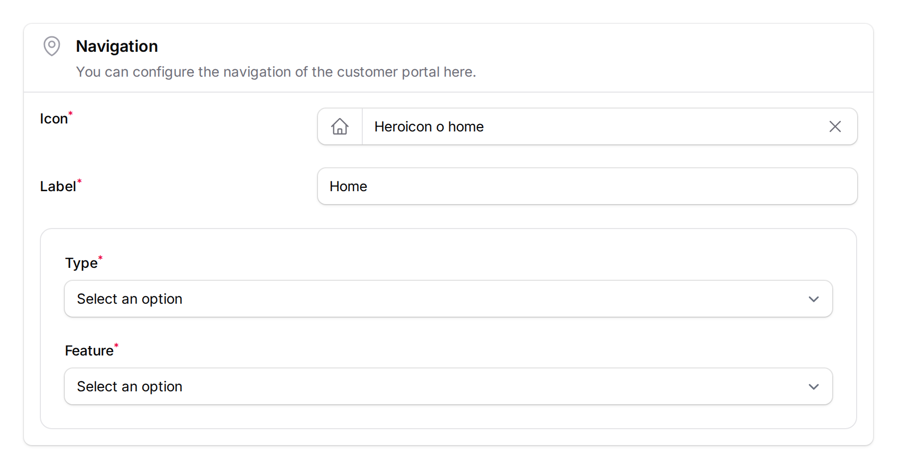
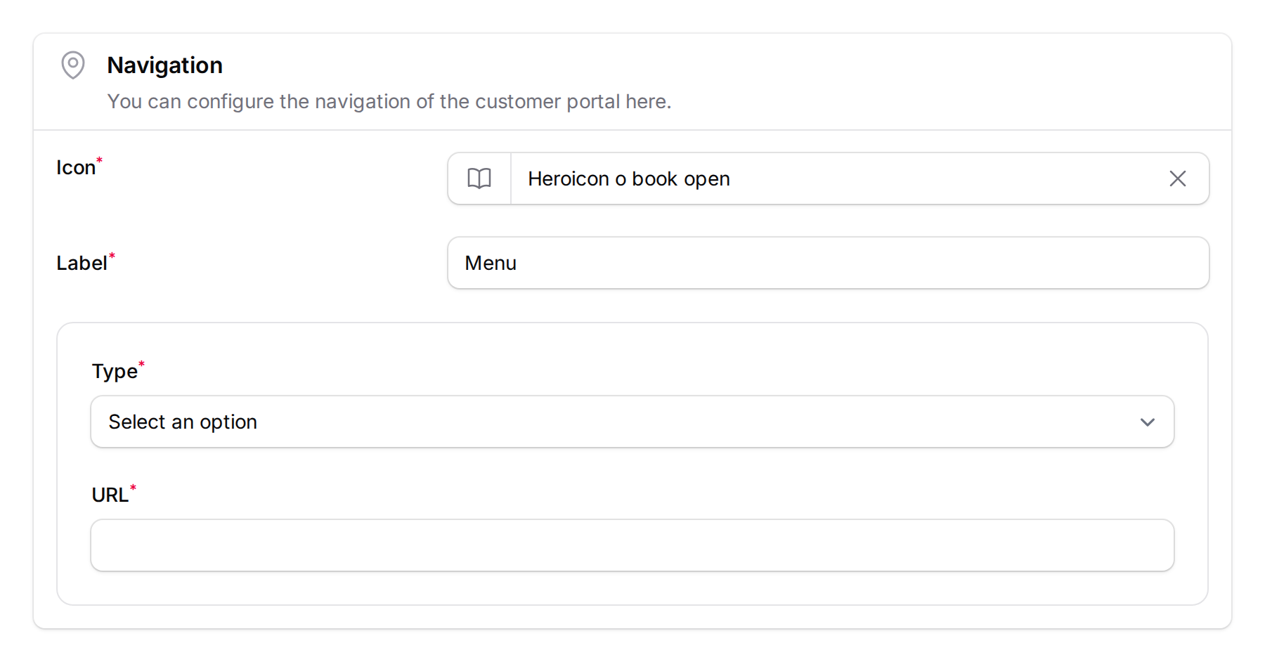
Click on any navigation button to expand it and edit its settings.
Each button has two parts:
Left side — Appearance:
- Icon — pick from a library of professional icons. This is the small picture customers see in the bottom bar.
- Label — the text below the icon (max 10 characters). Keep it short — "Home" or "Rewards" works better than "Go to Rewards Page".
Right side — Destination:
- Type — choose what happens when a customer taps the button:
- Feature (Internal Navigation) — takes the customer to a page inside the portal
- External Link — opens a website in a new tab
Here is what a navigation button looks like when set to the Feature type (linking to the Home page):
And here is one set to External Link (pointing to an external menu page):
-
Click Save at the bottom of the page. Your customers will see the updated navigation the next time they open the portal.
To start over, click Use Default above the navigation buttons list. This restores the four standard buttons: Home, Order, Rewards, and Profile.
Available Feature Links
When you choose the Feature type, you can link to any of these portal pages:
| Feature | What it opens |
|---|---|
| Home | The main portal home page |
| Ordering | Your online menu or ordering system |
| Rewards | Browse and claim available vouchers |
| Membership (Points) | View point balance and transaction history |
| Reservations | Browse available reservation slots |
| Make Reservation | Go straight to the booking form |
| Profile | Customer's profile page |
| View Reward | A specific reward you choose |
| View Claimed Rewards | Rewards the customer has already claimed |
| Credits | Store credit or top-up balance |
| Membership Tier Benefits | Tier perks and progress |
| Referral | Refer-a-friend page |
| Feedback | Submit feedback form |
| Receipt Upload | Upload a receipt for points |
| Paid Membership | Purchase a membership plan |
What Your Customers Will See
The navigation bar sits at the very bottom of the portal screen — a row of up to 4 icon buttons that is always visible. When a customer taps a button, the icon and label turn to your theme's primary colour to show which page they are on.
On phones, the bar sticks to the bottom of the screen so customers can reach it with their thumb. On desktops, it appears at the bottom of the portal window.
If a button links to a feature that is not enabled (for example, reservations when you have not set up a calendar), customers will see a brief "Not Available" message instead of a broken page.
Good to Know
- Maximum of 4 navigation buttons. This keeps the bar clean and easy to use on small screens.
- 10-character limit on labels. Short labels work best — "Book", "Rewards", "Home" are ideal.
- You cannot delete buttons, but you can change any button to something else or click Use Default to reset all four.
- Buttons can be reordered using the up/down arrow buttons in the admin panel.
- Navigation buttons are different from Quick Links. Quick Links appear on the home page as shortcut tiles. Navigation buttons are the permanent bottom bar visible on every page.
- External links open in a new tab, so customers do not leave the portal.
- The "Where is this used?" button in the admin panel shows you a picture of exactly where the navigation bar appears on the portal.
What's Next?
- What Are Rewards and How to Create Them — set up the rewards customers can navigate to from the portal
- Customer Reward Lifecycle Explained — understand what happens after a customer claims a reward