Understanding Your Point Report
What Is This?
The Point Report shows how loyalty points flow through your programme — how many points are being earned, how many are redeemed, and how they're distributed across your outlets. It's your go-to dashboard for tracking the health of your points economy.
Real-Life Example
Encik Imran runs FreshMart grocery stores across three locations in Selangor. He checks the Point Report every month to see which branch issues the most points and which has the highest redemption. The Setia Alam branch has low redemption rates, so he trains that branch's staff to remind customers about their points at checkout.
How to Access the Point Report
Open the Analytics panel and navigate to the Points report page.
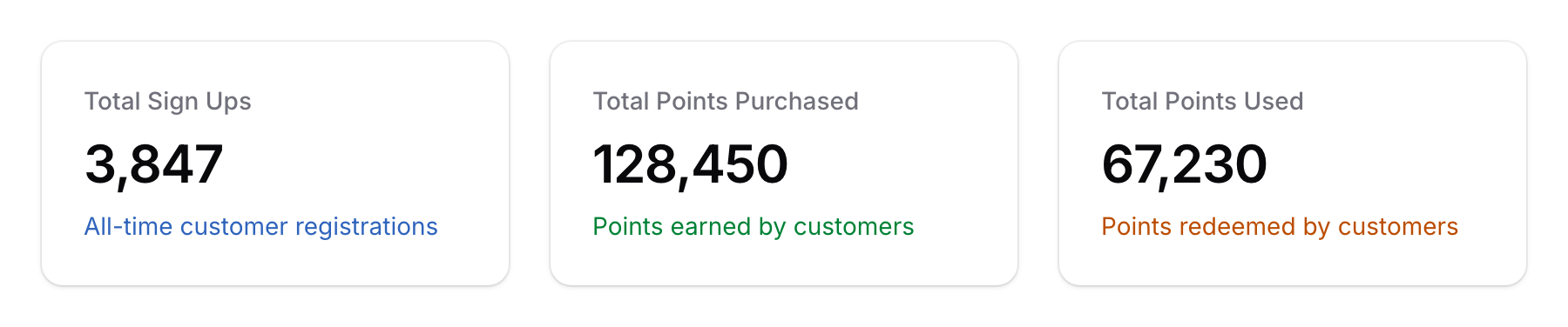
What You'll See
Charts
| Chart | What It Shows |
|---|---|
| Points Purchased (Earned) | Total points issued to customers over time — shows earning trends |
| Points Redeemed | Total points spent by customers over time — shows redemption trends |
| Points by Space | How points are distributed across your outlets — identifies top-performing branches |
Filtering
- Date Range — Focus on a specific period to track trends
- Space — View point activity for a specific outlet
How to Read the Report
Healthy Points Economy
A healthy loyalty programme shows:
- Steady earning trend — Points being issued consistently means customers are making purchases
- Growing redemption trend — Points being redeemed means customers are engaged and coming back
- Balanced earn-to-redeem ratio — If customers earn a lot but never redeem, they may not know about their rewards
Warning Signs
- Earning drops — Could mean fewer customer visits or staff forgetting to record points
- Low redemption — Customers may not know they have points, or rewards may not be attractive enough
- Imbalanced spaces — If one branch issues far fewer points than others, check if staff are properly trained
Good to Know
- Points earned vs redeemed — Ideally, these trends should both grow over time. A large gap between earned and redeemed points means you have dormant value sitting in customer wallets.
- Space comparison — Use the Points by Space chart to compare outlets fairly. A branch with more footfall will naturally issue more points.
- Seasonal patterns — Expect point activity to peak during festive seasons (Hari Raya, CNY, Christmas) and dip during quiet months.
- Combine with other reports — Cross-reference the Point Report with the Customer Report to understand if point growth comes from new signups or repeat visits.